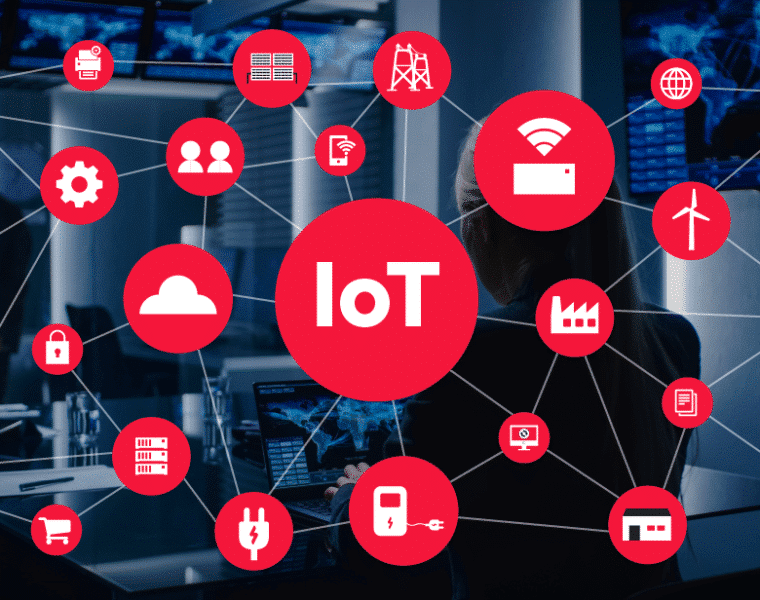
Never before has data been as accessible as now. Sensor technology has advanced so far that they can be very small. That’s why sensor technology can be installed just about anywhere to collect various kinds of data. That also means that individual products can become part of the IoT network.
A good example of this is the wristwatch. We used to use them to tell the time. But sensor technology opens up a whole new world of possibilities: We can measure our heart rate, see our sleep quality, check the weather, read emails and even pay at a supermarket checkout. The sky’s the limit.
There were over 10 billion active IoT products in 2021. An estimated 25.4 billion will be active by 20301. That’s means more than twice as much available data in less than ten years! But what is all that data worth?
Systemise your data
With so much data flying around, there’s no guarantee it will give more value. Only once it’s collated on a single platform and presented in a simple format can we understand and use it. It then becomes easier to take the appropriate action. By presenting data more simply, we can get more out of it.
Let’s look at an example from the power industry: the temperature in a grid transformer station. Below is a graphic presentation of the temperatures of two different transformers in the same grid station. They also show the indoor and outdoor temperature. We can see that the transformer temperature rose in line with the indoor temperature.
That lets us quickly see that the increase in temperature is not due to a fault with the transformer itself. It was the ambient environment that caused the rise in temperature.
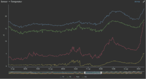
Temperatures of two different transformers in the same grid station, and also show the indoor and outdoor temperature
In other words:
- By graphically presenting data with other data – e.g. outdoor and indoor temperatures on the same graph – it becomes easier to reach conclusions.
- If the data had been presented in a table, it would be harder to see the relationship. By visualising data in such formats as graphs, the picture becomes much clearer.
More data can mean more efficiency, but can also mean headaches
For example, by having data presented in both real time and through a historical perspective, you get a better basis on which to make decisions and thus more out of your resources.
We also need to move away from working in silos. The data we gather ought to be used to its full potential to ensure more efficient operation regardless of sector. By breaking down traditional silos, we can improve coordination and gain valuable insight that will help everyone involved.
To ensure efficient operation, you need to be able to quickly see changes
With the right data, you can go from being reactive to proactive.
It will be easier to see where improvement is needed and where problems lie with good graphic presentations, historical data and real time updates.
Such factors are essential to ensure efficient operation.
Where next?
Machine learning concerns data processing, and the more data put in, the better the machine learning. That’s why it’s important to move progress in the direction that will break down silos. We need to work towards a future in which data can be shared across departments, companies and even industry sectors.
Want to read more about – Your data Your Insight ?